
If you run an ecommerce business, abandoned carts are probably the bane of your existence. You were so close to a sale, and now it feels like they’ve slipped through your fingers. You’re not alone though – recent statistics have shown that cart abandonment rates for online retailers can be as high as 80%, and since 2015 four trillion dollars worth of carts have been ditched.
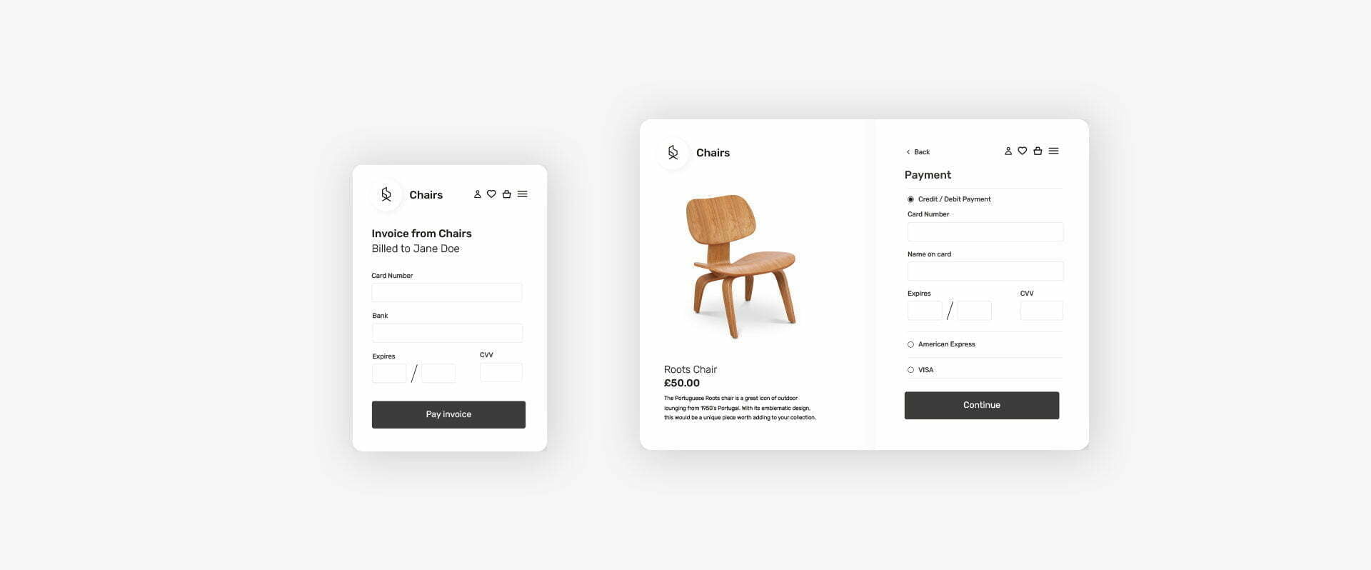
So how you can prevent this and secure more sales? A big part of the problem may well be the final hurdle – your checkout page. Your checkout page design is actually a crucial part of converting your customers. A poorly designed checkout page will have customers giving up on their purchases in droves. Too confusing? They’ll leave. Too long? They’ll leave. Doesn’t feel safe enough? They’ll definitely leave.
It’s important to focus on making your checkout page as streamlined, efficient and straightforward as possible, whilst also making sure that your customers’ details and payments are protected. To help you out, we’ve put together the following gifographic to share our top tips and best practices for checkout page design. Take a look below.
